It’s only a few weeks until we release the new PeopleMaps site and products – and we can’t wait to unveil the new look. The new site and products are radically different – and the change in our look and feel will hopefully represent that.
Checking out our new logos last week, I was prompted to think of how far we’ve come since the early days – (and not only in terms of design) …
We hadn’t even gone dot com back in 2001!

Our old questionnaire used radio dials – no fancy Flash or Ajax for us back then …

How fond of purple were we? This was back when we still serviced only jobseekers…

But the best look of the day might have been our illustrious leader … nice tie, @peoplemapsmg!

And then we opened up to business accounts… and everything was starting to be more recognisable …


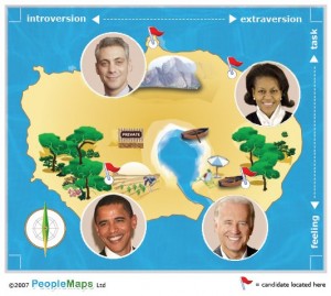
The next move we made was to hire our wonderfully talented designer Craig, and even our map started to take on a very identifiable look…


So what’s coming your way? Well, here’s a little taster …


A little different, huh? Hope you like it. We do …. very much 🙂


You DID look respectable…little did people know!
Hope you are all doing okay.
The website has gone from an old look to as new one but I’m not sure we can say the same about Martin? 🙂
No matter whether you have a tie or not we still love you loads xx
To think these days I don’t even own a tie. I looked very respectable back then; dull even. My how things have changed. I have managed to throw off most of my respectability 🙂